Logos
Point Loma Nazarene University's primary logo, president's seal, and Sea Lion athletics logo are often the initial and most recognizable identifiers of the university brand, and therefore among its most important assets. Because of this, brand ambassadors are implored to ensure proper usage of PLNU's logos without altering them.
Primary Logo
PLNU's horizontal, vertical, and acronym logo formats are the primary logo visual representations for the university and should be used whenever possible to create visual consistency along all branded touchpoints. Additional logo formats have been created for circumstances where the use of the preferred logo formats is not ideal. PLNU's primary logo formats, from left to right: horizontal, vertical, and acronym. These versions should be used whenever possible.

Color
Using consistent logo color formats is essential to maintaining the strength of our brand in all mediums. It is preferred that the logo appear in two colors: Point Loma Green PMS 343 and Point Loma Gold PMS 4505. Other variations include one-color black, green, or white (reversed).

PMS: 343c
CMYK: 88.41.78.38
RGB: 14.85.63
HEX: #0E553F

PMS: 4505c
CMYK: 38.40.87.10
RGB: 155.133.66
HEX: #9B8542
Clear Space and Size
Clear space refers to the minimum amount of "white space" around the logo that should always be free from copy, page edges, graphics, or other distracting elements. A larger clear space around the logo is always beneficial. Clear space is determined by the height of the Greek.
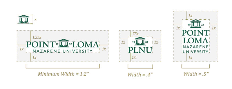
Minimum size ensures Point Loma Nazarene University logos always retain their visual integrity and legibility, building and maintaining equity in the brand.
The logo sizes shown are the smallest size at which logos are approved for use. Larger sizes are recommended.
Alignment
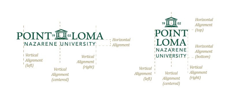
Compositions that create movement are a cornerstone of the PLNU brand. To achieve this movement, asymmetrical balance is often deployed to direct the eye across the composition.
Incorrect Use
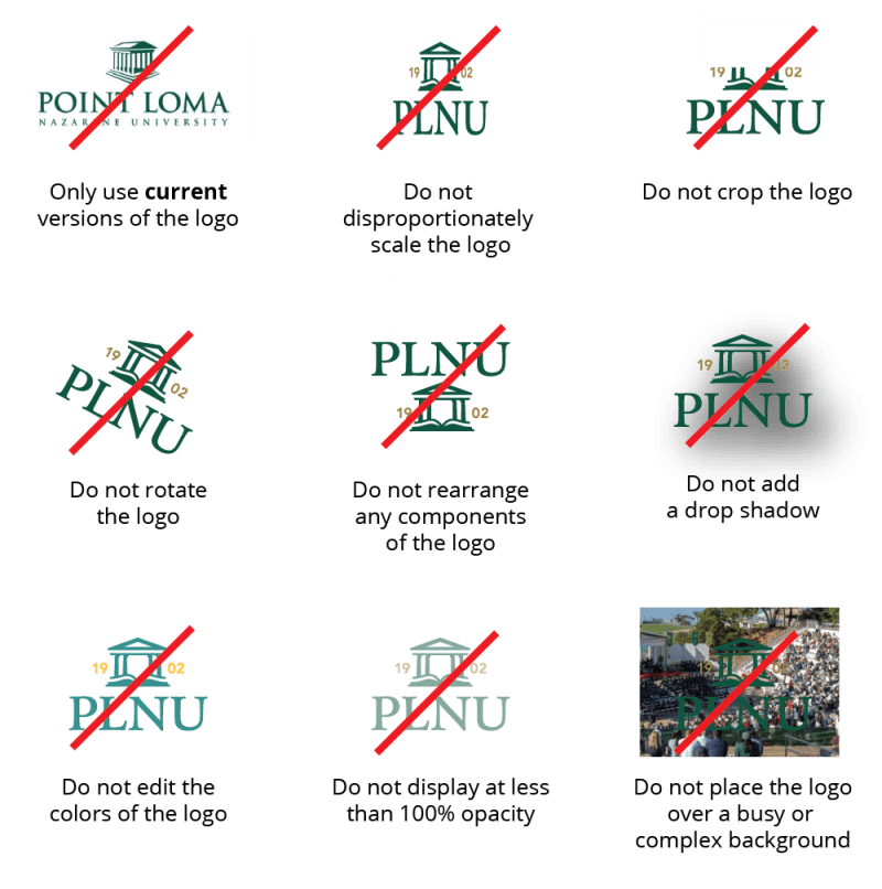
Incorrect uses of the PLNU logo are shown below. Incorrect usage rules apply to all logo formats in the logo system.
President's Seal
The President's Seal is a brand asset that should be protected and used with great care. For this reason, its use is restricted to the following usage only:
- President's Office.
- Academic-related events (such as graduation or honor society materials).
- High-end brand communications (such as donor or advisory board materials).
- Heritage or historical context (where the history of PLNU is the primary subject matter).
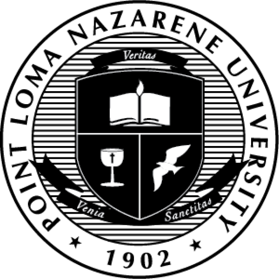
Note: Use of the President's Seal must be approved in writing by the Vice Provost prior to publication. MCS will manage that process, please reach out to MCS to request.
Athletics Logo
Athletics Primary
The Athletics primary logo is also the primary wordmark. It is the primary identifier when speaking of athletics as a whole, not an individual team/program. It may not be used without written consent from PLNU Athletics.
Athletics Monogram
The Point Loma Athletics monogram is a secondary identifier for athletics at PLNU. The monogram is also the primary identifier for the baseball program. It may not be used without written consent from PLNU Athletics.
Athletics Crest
The Point Loma Athletics crest is a secondary identifier for athletics at PLNU. The crest is also a primary identifier for all individual athletics programs (other than baseball). It may not be used without written consent from PLNU Athletics.
Athletics PLNU Uniform Asset
The PLNU uniform wordmark is reserved for use on NCAA sanctioned Point Loma team uniforms and athletics promotional materials related to uniforms. It may not be used without written consent from PLNU Athletics.
Athletics Point Loma Uniform Asset
The Point Loma uniform wordmark is reserved for use on NCAA sanctioned Point Loma team uniforms and athletics promotional materials related to uniforms. It may not be used without written consent from PLNU Athletics.
Athletics Sea Lions Uniform Asset
The Sea Lions uniform wordmark is reserved for use on NCAA sanctioned Point Loma team uniforms and athletics promotional materials related to uniforms. It may not be used without written consent from PLNU Athletics.
Athletics Lockup
The Athletics lockup logo is also the primary wordmark for individual sanctioned NCAA teams. It is the primary wordmark/identifier for individual teams. Sport-specific wordmarks unify athletics and promote consistency across the brand by sharing a common visual language and hierarchy. Each sport has its own name below “Point Loma” using Gotham Black font. New lockups may not be created or used without the written consent of PLNU Athletics.
Colors
Color sets the tone for PLNU’s look and feel and is a powerful expression of our brand. Our palette is rooted in the green and gold that have represented Point Loma for generations, complemented by accent colors and supporting neutrals. Consistent and intentional use of color helps our communications feel recognizable, cohesive, and distinctly PLNU.
Primary Brand Colors
Green and gold are PLNU’s signature colors and the foundation of our visual identity. They should have the strongest presence across university communications, building recognition and creating a clear connection to the PLNU brand.
PMS: 343c
CMYK: 88.41.78.38
RGB: 14.85.63
HEX: #0E553F

PMS: 627c
CMYK: 87.41.77.71
RGB: 0.50.33
HEX: #003221
PMS: 4505c
CMYK: 38.40.87.10
RGB: 155.133.66
HEX: #9B8542

PMS: 4515c
CMYK: 30.31.69.2
RGB: 181.162.104
HEX: #B6A269
Accent Colors
The Accent Color Palette is inspired by PLNU’s iconic ocean setting and golden sunsets. These two colors have distinct roles within the PLNU brand, adding energy and flexibility to our visual identity. Used alongside our primary colors, they create emphasis, variety, and expression for different audiences and communications.
Ocean Teal is used in small amounts to add vibrance, direct attention, and create visual interest.
Sunset Gold is a higher-energy accent that can have greater prominence for younger audiences, including prospective and undergraduate students.

PMS: 7474c
CMYK: 77.26.46.3
RGB: 47.143.141
HEX: #2F8F8D

PMS: 123c
CMYK: 0.23.91.0
RGB: 255.198.39
HEX: #FFC627
Supporting Neutrals
Supporting neutrals provide balance, warmth, and flexibility. Use them for backgrounds, secondary elements, or to create breathing room around our primary and accent colors.

PMS: Warm Gray 11c
CMYK: 52.53.59.24
RGB: 112.98.89
HEX: #706259

PMS: Warm Gray 7c
CMYK: 42.41.45.4
RGB: 151.139.130
HEX: #978B82

PMS: Warm Gray 4c
CMYK: 30.28.32.0
RGB: 182.173.165
HEX: #B6ADA5

PMS:7534c
CMYK: 19.16.26.0
RGB: 208.202.185
HEX: #D0CAB9
Guidelines for Color Usage
DO
- Lead with PLNU's core colors.
- Use neutral colors to support the palette and let key content stand out.
- Use accent colors intentionally and sparingly.
- Keep your palette focused.
- Check contrast for text.

DON'T
- Use every PLNU color in one design.
- Let accent colors unintentionally overpower the communication.
- Create new colors or alter approved values.
- Use combinations that make text difficult to read.

Recommended Color Combinations
The PLNU Color Palette can be combined in many different ways to express the brand both consistently and specifically, depending on your audience.
| Palette | Combination |
|---|---|
| Classic PLNU |  |
| Warm & Academic |  |
| High Energy |  |
| Neutral |  |
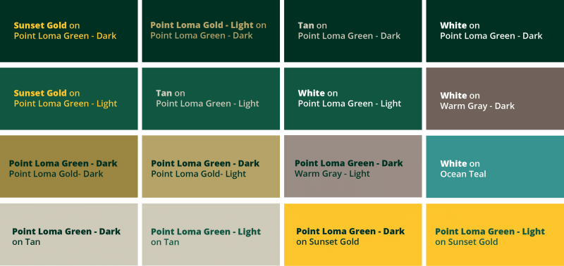
Accessible Color Combinations
WCAG standards require minimum color contrast ratios for all designs to ensure readability for people with low vision.
Sub-Branded Logos
Within the PLNU brand, there are frequently sub-branded offerings that require varying levels of distinction within their logo that sets them apart from the Master Brand Identity. For this reason, a series of sub-branded templates were created to provide guidance for their creation to ensure brand integrity across all usage scenarios.
Level B: Core with Department Distinction

Level C: Core with Guided Distinction

Premade Lockups
To access and download available premade logo lockups, click here. If you do not see what you need in our available lockups, please submit a request via email to mcsprojects@pointloma.edu.
Typography
Use consistent typefaces to provide a branded visual voice to all of our written words.
Design Fonts
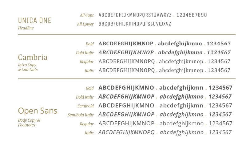
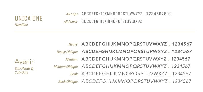
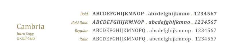
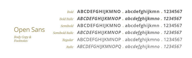
Unica One, Avenir, Cambria, and Open Sans are the system fonts for PLNU and should be used whenever possible.
Unica One is a modern typeface that has the ability to express a more sophisticated or high-intensity tone depending on whether ALL CAPS or lowercase is used (Note: The "T" is always used in upper case as it impedes legibility in lowercase usage). When paired with Avenir (in ALL CAPS), it can create a distinctive yet flexible intersection of size variation, movement, and expressive personality within a branded communication.
Cambria is an approachable serif that provides a slightly more traditional tone to communicate the prestige that PLNU has to own. Use in a support capacity only.
Open Sans is a clean and friendly sans serif that is highly legible and accessible for all body copy.
Electronic Fonts
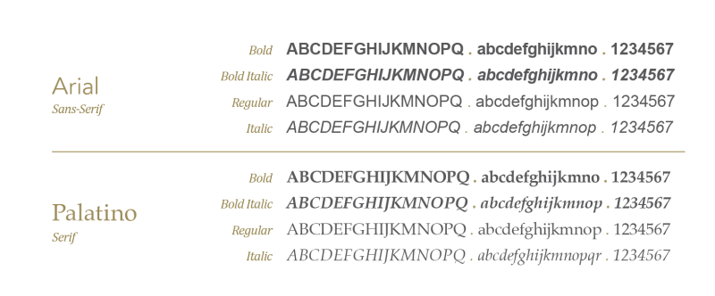
These fonts have been selected for day-to-day use and should be used in programs such as PowerPoint, Word, and Excel. Arial and Palatino have been selected as the electronic fonts and are available for use on all computers. These fonts are to be used in place of the design fonts in order to maintain appearance across multiple computers and users.
Web Fonts
A "Web Font" is a font that was specifically designed for on-screen use for optimum legibility. Unica One, Cambria, and Open Sans (while design fonts as well) are approved and available for use in our website and email programs. NOTE: Verdana is an approved default font to use in place of Open Sans when technical constraints apply.